1. 屏幕尺寸 #
- 指屏幕对角线的长度,单位是英寸,1英寸=2.54cm
2.像素 #
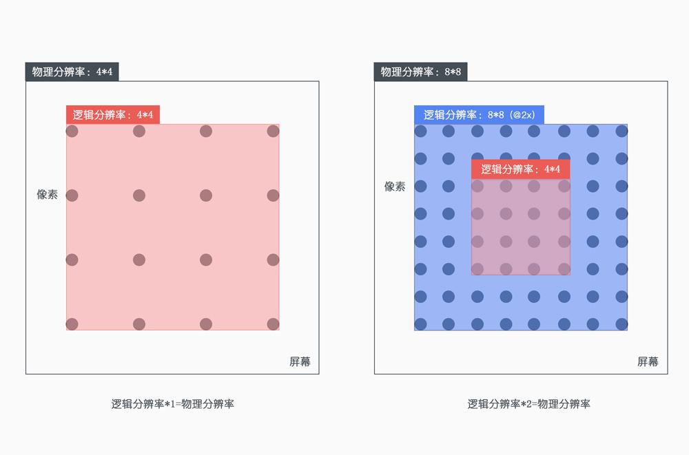
2.1 屏幕分辨率(物理像素) #
- 指在横纵方向上的像素点,单位是px,1px=1个像素点
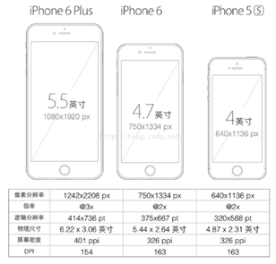
- 这里的1像素指的是设备的1个物理像素点。如第一点中的图,iphone6的分辨率为750*1334px,即是横向上有750个物理像素点,纵向上有1334个物理像素点。
2.2 像素密度(pixels per inch,PPI) #
- 屏幕上每英寸可以显示的像素点的数量,单位ppi;屏幕像素密度与屏幕尺寸和屏幕分辨率有关。以上图的iphone6的为例: 开方(750750+ 13341334)/ 4.7英寸 = 326 ppi
2.3 位图像素 #
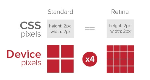
- 1个位图像素对应1个物理像素,图片才能得要完美清晰的展现(不失真,不锐化)
- 要显示宽度为30px18px(CSS像素)的照片,在DPR为2的情况下,对应的图片需要为60px36px;DPR为3的情况下,对应的图片需要为90px*54px;基于此种情况,移动端的图片一般需要设计2套,以适应不同的像素比
2.4 设备独立像素 #
- 设备独立像素是CSS像素和物理像素之间转换的很重要的关键点
- 在设置了
width=device-width时,那么设备独立像素就等于CSS像素
2.5 像素比 #
- 定义:设备物理像素比上设备独立像素
- 公式:devicePixelRatio = 设备物理像素(分辨率) / 设备独立像素(近似CSS像素)
- 以iphone6plus为例:DPR = 1080 / 414 ≈ 3
- 通过JS获取:
window.devicePixelRatio - 通过CSS获取:
@media only screen and (-webkit-min-device-pixel-ratio:2){}
3.视口 #
3.1 布局视口(layout viewport) #
- 在移动设备上,为了容纳为电脑浏览器设计的网站,默认的布局视口的宽度远大于移动设备屏幕的宽度
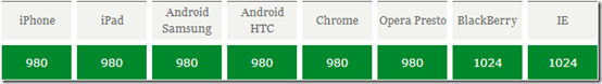
- 以下是常见的移动端浏览器的布局视口值,单位为px(CSS像素),该值是不可变的(布局视口不变,和性能有关系,如果布局视口变化了,那么就会触发重汇重排)
- 可以通过
document.documentElement.clientWidth来获取布局视口值 - 当网页的宽度大于以上的值时,就会出现横向滚动条。
- 以iphone5为例,宽度占满的时候,需要640个物理像素,换而言之,需要980px的CSS像素,其对应的像素比为:640/980
- 另一种情况,设置了
width=device-width的情况下,即是布局视口的宽度等于设备独立像素,这种情况下,CSS像素就等于设备独立像素了
3.2 视觉视口(visual viewport) #
- 用户看到的网站展示区域,一般视觉视口和设备宽度一致
- 并且它的CSS像素的数量会随着用户缩放而改变,单位是px(CSS像素);该值是可变的(缩放情况下)。可以通过
window.innerWidth获取,iphone6就是375px。
3.3 理想视口(ideal viewport) #
- 布局视口的默认宽度并不是一个理想的宽度,于是 Apple 和其他浏览器厂商引入了理想视口的概念,它对设备而言是最理想的布局视口尺寸。显示在理想视口中的网站具有最理想的宽度,用户无需进行缩放
- 理想视口的值其实就是屏幕分辨率的值,它对应的像素叫做设备逻辑像素(device independent pixel, dip)
- dip 和设备的物理像素无关,一个 dip 在任意像素密度的设备屏幕上都占据相同的空间。如果用户没有进行缩放,那么一个 CSS 像素就等于一个 dip
<meta name="viewport" content="width=device-width">可以使布局视口与理想视口的宽度一致- 刚好符合手机屏幕尺寸显示完美页面的区域称为理想视口
ideal layout
3.4 视口设置 #
<meta name="viewport"
    content="width=device-width,initial-scale=1.0,maximum-scale=1">
|属性名|取值|描述| |width|正整数或device-width|定义视口的宽度,单位为像素| |height|正整数或device-height|定义视口的高度,单位为像素,一般不用| |initial-scale|[0.0-10.0]|定义初始缩放值| |minimum-scale|[0.0-10.0]|定义放大最大比例,它必须小于或等于maximum-scale设置| |maximum-scale|[0.0-10.0]|定义缩小最小比例,它必须大于或等于minimum-scale设置| |user-scalable|yes / no|定义是否允许用户手动缩放页面,默认值 yes|
当缩放比例为 100% 时,dip 宽度 = CSS 像素宽度 = 理想视口的宽度 = 布局视口的
3.5 缩放 #
- 用户放大:一个CSS像素的面积变大,视觉视口内的CSS像素个数变少,视觉视口的尺寸变小(能看到的内容变少了,所以视觉视口变小);切记,布局视口的大小是不变的,没有设置
width=device-width的情况下,布局视口是980px;设置了width=device-width的情况下,布局视口的大小等于设备独立像素 - 用户缩小:一个CSS像素的面积变小,视觉视口内的CSS像素个数变多,视觉视口的尺寸变多(能看到的内容变多了,所以视觉视口变大);切记,布局视口的大小是不变的,没有设置width=device-width的情况下,布局视口是980px;设置了width=device-width的情况下,布局视口的大小等于设备独立像素
- 系统缩放:在meta标签中使用initial-scale=1.0,该initial-scale值改变的是布局视口和视觉视口,而width=device-width改变的是布局视口
- 当布局视口超过视觉视口才会出现滚动条
initial-scale值的变化对布局视口和视觉视口的影响:在iphone6下,该值变大的时候,CSS元素的面积变大,看到的内容变少了,所以布局视口和视觉是变小了为187;反之,设置initial-scale为0.5时,布局视口和视觉视口都会变大,变为750.- 如果
width=device-width和initial-scale都设置了,谁的值大就听谁的.最终布局视口和视觉视口为750px
4. REM #
- 我把页面中CSS的像素单位全部都放大DPR倍的比例,就是用布局视图来写,就刚好对应设计稿的单位大小啦,整个页面写完后再整体将页面的比例缩小1/DPR倍,就刚好回到CCS对应的逻辑像素单位啦
- REM是一个相对单位 ,是相对于根元素,也就是html标签的font-size值,如果HTML的font-size=14px,则1rem=14px
- REM的本质是等比例缩放,所以REM布局提供了等比例缩放的布局能力
- REM还需要添加视口变化之后的事件绑定,重新设置HTML的
font-size - REM是一个相对单位,PX是一个绝对单位
<head>
    <meta charset="UTF-8">
    <meta name="viewport" content="width=device-width, initial-scale=1.0">
    <meta http-equiv="X-UA-Compatible" content="ie=edge">
    <title>REM</title>
    <style>
        html{
            /* font-size:375/10; 37.5px*/
        }
        #box{
            width:2rem;/* 75px */
            height:2rem;/* 75px */
            border:1px solid red;
        }
    </style>
    <script>
        let root = document.documentElement;
        function resize(){
            root.style.fontSize = root.clientWidth/10+'px';
        }
        resize();
        window.addEventListener('resize',resize);
    </script>
</head>
5. vw+rem #
- vw: 1vw等于布局视口宽度的1%
- 浏览器兼容性不好的时候rem是最好的解决方案,兼容性好的时候vw就是最好的解决方案。
- 可以配合postcss插件,直接使用视觉稿来进行布局计算,减少了转换单位的时间,也不用担心兼容性问题。
- 支持vw则10rem等于10vw,可以直接使用vw单位,如果不支持vw,则10rem=cientWith/10
6. px 自动转成rem #
- 使用px2rem-loader
- 页面渲染时计算根元素的
font-size值 - lib-flexible
6.1 安装 #
cnpm i px2rem-loader lib-flexible -D
6.2 index.html #
index.html
<head>
    <meta charset="UTF-8">
    <meta name="viewport" content="width=device-width, initial-scale=1.0">
    <meta http-equiv="X-UA-Compatible" content="ie=edge">
    <title>主页</title>
    <script>
      let docEle = document.documentElement;
      function setRemUnit () {
        //750/10=75   375/10=37.5
        docEle.style.fontSize = docEle.clientWidth / 10 + 'px';
      }
      setRemUnit();
      window.addEventListener('resize', setRemUnit);
    </script>
</head>
<body>
    <div id="root"></div>
</body>
6.3 reset.css #
*{
    padding: 0;
    margin: 0;
}
#root{
    width:375px;
    height:375px;
    border:1px solid red;
    box-sizing: border-box;
}
6.4 webpack.config.js #
 {
        test:/\.css$/,//如果要require或import的文件是css的文件的话
        //从右向左处理CSS文件,oader是一个函数
        use:[{
                loader:MiniCssExtractPlugin.loader,
                options:{
                     publicPath: (resourcePath, context) => {
                        return '/';
                    }
                    //publicPath: '/'
                }
        },{
                    loader:'css-loader',
                    options:{
                        //Enables/Disables or setups number of loaders applied before CSS loader.
                        importLoaders:0
                    }
                },{
                    loader:'postcss-loader',
                    options:{
                        plugins:[
                            require('autoprefixer')
                        ]
                    }
                },{
+                    loader:'px2rem-loader',
+                    options:{
+                        remUnit:75,
+                        remPrecesion:8
+                    }
+                }]
+            },
概念 #
尺寸 #
- 屏幕尺寸
- 英寸
像素 #
- 屏幕分辨率
- 物理像素
- 像素密度
- 位图像素
- 设备独立像素
- 设备像素比devicePixelRatio
单位 #
- px:pixel,像素,电子屏幕上组成一幅图画或照片的最基本单元
- pt: point,点,印刷行业常用单位,等于1/72英寸
- ppi: pixel per inch,每英寸像素数,该值越高,则屏幕越细腻
- dpi: dot per inch,每英寸多少点,该值越高,则图片越细腻
- dp: dip,Density-independent pixel, 是安卓开发用的长度单位,1dp表示在屏幕像素点密度为160ppi时1px长度
- sp: scale-independent pixel,安卓开发用的字体大小单位
视口(viewport) #
- 布局视口
- 视觉视口
- 理想视口
- 缩放
布局 #
- 媒体查询
- 百分比
- REM
- vw